Why is Responsive Website Design Essential for SEO?
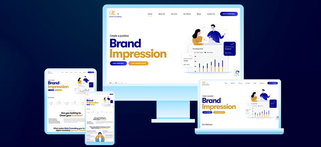
A responsive website design involves creating a website that adapts to various screen sizes, layouts, platforms, etc. Web designers and developers use flexible grids, layouts, responsive images, CSS media queries, etc., to build these websites. With most users using their mobile devices when performing a search or accessing a website, responsive website design has become an essential aspect of web development. You can hire a web development company in Ontario to build a responsive website.
10 Benefits of Responsive Website Design
Responsive Website Design is a critical aspect of website development. Having a responsive design for your website will offer the following benefits. Let’s discuss further.
Improve User Experience
Responsive design helps improve user experience. The website will adjust to the user’s devices’ screen size and orientation, providing the user with an optimal viewing experience. Further, the users can easily navigate and interact with the website regardless of their devices.
Time spent on a website signifies whether the website content matches search intent. As a result, if the user spends more time on a website, it is a positive sign that the website matches the user’s search query. A responsive design encourages users to spend more time on a website exploring it further. This improved user experience can further help improve the website’s SERP ranking with related searches.
Search Engines Prioritize Mobile Responsiveness
Taking a cue from the previous point, prioritizing responsive web design can help improve your website’s search ranking. Search engines prioritize mobile responsiveness when displaying results based on search queries. As an increasing number of users are relying on their mobile devices when performing an online search or accessing a website, one can’t ignore the significance of mobile responsiveness for a website. Hence, search engines favour user-friendly and mobile-responsive websites on their result pages.
Increased Reach
A responsive design allows a broader audience to access your website through their mobile devices, increasing your audience reach. It helps present your brand and content to relevant users irrespective of their devices. More brand exposure can increase traffic, leads, and eventually paid customers.
Easy To Maintain
Mobile-responsive websites are easy to maintain as they do not require developers to manage multiple site versions for varying devices. Maintaining a single website helps save time and money and avoids complexities in updating multiple sites.
Faster Loading Speed
Following responsive design principles can help improve the loading speed of your website. The reason is a responsive website needs one URL and a set of HTML codes. As a result, it doesn’t need to redirect users to different pages based on their device. It helps improve user experience and reduce bounce rates.
Lower Bounce Rates
Bounce rate implies the percentage of users that left your site immediately after visiting it. This metric helps indicate whether a website matches the user’s search intent. A higher bounce rate implies that your website is either not relevant or has a slow loading speed that frustrates visitors and causes them to leave your site immediately. A responsive design can reduce your bounce rate by improving user experience and loading speed.
Competitive Advantage
In this digital landscape, the market has become competitive. As a result, if brands want to survive and thrive in the market and outrank their competitors, they cannot ignore having a responsive website design. It offers a seamless user experience, encourages visitors to spend more time exploring and interacting with your website, and thereby improves opportunities for sales and conversion.
Increase Conversion Rates
A responsive design can also help improve conversion rates. Optimizing a website for various devices can encourage users to explore the website and engage with the content, leading to increased sales and conversion.
Better Analytics
With a responsive design, you can monitor your website performance across all devices. It allows you to gather and analyze data from different platforms, screen sizes, etc. As a result, you gain valuable insights about user behaviour. Learning about how your users interact with your website can help you make data-driven decisions to boost your website’s performance.
Future Possibilities
Implementing responsive design ensures that your site remains accessible to users regardless of what new technology is introduced in the future. It further ensures that your website stays relevant in the future as well.
Therefore, you should prioritize responsive design to boost your website’s performance and experience these benefits. HireH Consulting is a web design agency in Wallaceburg, Ontario that can help create mobile-responsive websites that meet your business needs.


